Hi all, apologies on this post being late. I moved house two weeks ago and started a new job today- so things have been quite crazy!
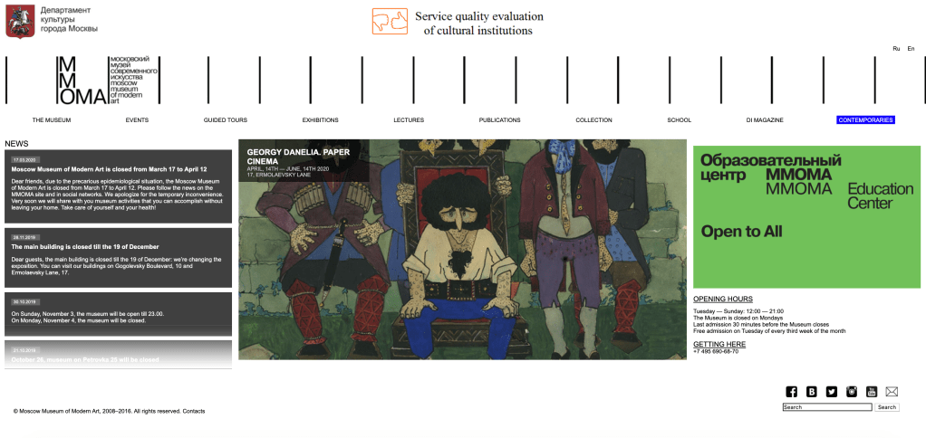
I have chosen to analyse the Moscow Museum of Modern Art website located in English, at the following link: http://www.mmoma.ru/en/. Hopefully such a unique case analysis will garner your attention despite my tardiness!
The website has a fast navigation bar, which details the links that people are most likely to click at the top of their website. They have their social connect widgets bottom right, which is tolerable, however, their search bar is the last thing on the whole web page – under these social widgets! I would suggest as my first immediate improvement that the search bar be located at the top of the web page. See below screenshot of the search bar located in the bottom right hand corner of their home page:

The webpage otherwise loosely follows the “F” shape design placement. The dynamic design means that they utilise what they show on the main page: a news feed, followed by rotating images of exhibitions (the MOMA is spread across 6 venues – so the organisation hosts many different exhibitions including different varieties of exhibitions). Their contact details and details of their educational events are then the two prongs of the “F.” Overall, I think the website has a very good organisational structure and every link I click is reliably returning the affiliated page.
In terms of accessibility, there are little image descriptions available. This is strange because of their progressive role within Russia- and their landmark 2019 exhibition “Touch!” which focussed on creating an inclusive museum environment for visitors with disabilities (Moscow Museum of Modern Art, 2020b). They do have high contrast between backgrounds and texts, text is able to be made larger without affecting website views, and the links are accurate – with input fields also labelled clearly, and the website displays multiple ways of finding information (Government of Western Australia, n.d.; Yang and Lee, 2015, pp. 189-190). The imagery of the museum and people at the museum is emotive (Hadley, 2017), especially in their educational pages. The style and layout of the website is consistent throughout each page (Yang and Lee, 2015, p. 197). Language is not technical which increases the “universality” of access to the website (Gambrell, 2015).
References:
Gambrell, K. (2015). 7 best practices for creating a user friendly library website. Retrieved from https://www.ebsco.com/blog/article/7-best-practices-for-creating-a-user-friendly-library-website.
Government of Western Australia. (n.d.). Tips to make your website accessible. Retrieved from: http://www.disability.wa.gov.au/Global/Publications/Understanding%20disability/Built%20environment/Accessible%20websites%20checklist.pdf.
Hadley, P. (2017). What do the best museum websites all do? Retrieved from: https://blog.cogapp.com/what-do-the-best-museum-websites-all-do-8d6727504605.
Moscow Museum of Modern Art (2020a). Retrieved from: http://www.mmoma.ru/en/.
Moscow Museum of Modern Art (2020b) For Visitors with Intellectual or Developmental Disabilities. Retrieved from: http://Www.Mmoma.Ru/En/Guided_Tours/Accessibility/For_Visitors_With_Intellectual_Or_Developmental_Disabilities/.
Yang, S. Q. and Lee, Y. Y. (2015). Understanding Web Design andWeb Content Management. In Yang, S. Q., & Lee, Y. Y. (Eds.) Emerging Technologies for Librarians : A Practical Guide. (pp. 185-200). London: Elsevier Science & Technology.
Good website evaluation. You have made good use of the literature to support your discussion. Using screenshots of the webpage would have helped illustrate your points. I thought the website was also quite cluttered and. I hope you found this activity useful.
LikeLike